Hello everyone,
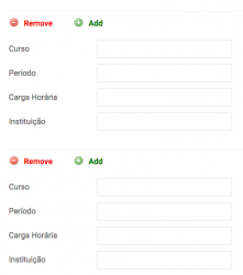
I added CSS codes to improve the usability of GroupX field buttons, see below:

This is the code:
aside.cck_cgx_button { float: left; width: 100%; border-top: 1px solid #eee; position: relative; margin: 20px 0; padding-top: 10px; }
.cck_button_del, .cck_button_add { width: 80px !important; height: 17px !important; background: no-repeat; padding-left: 25px; font-weight: bold; }
.cck_button_del:before { content: "Remove"; color: red; } .cck_button_add:before { content: "Add"; color: green; }
I added this code in template css (override).
Translate and choose better color in the last line.
Hope that's help.
Regards,